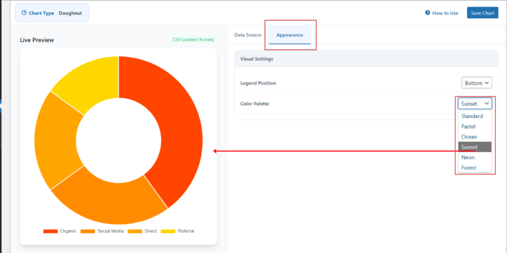
To change the visual style of your charts, you can utilize the Color Palette settings located within the Appearance tab. This feature allows you to instantly apply a coordinated set of colors to your data series.
Step 1: In the Chart Configuration panel, click on the Appearance tab.
Step 2: Locate the Color Palette dropdown menu.
Step 3: Select your preferred theme from the available options: Standard, Pastel, Ocean, Sunset, Neon, or Forest.
Step 4: View the changes in the Live Preview section. The palette will automatically assign different colors to each label (like Organic, Social Media, etc.) to ensure high readability.